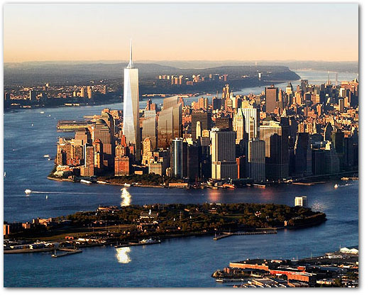
welcome back som. i was wondering whether they would return to their uninspiring crap architectural ways. i was initially a bit worried, after seeing the original redesign of the freedom tower back in 2003 and actually thinking that it looked nice. slender, elegant, and incorporating green architecture with its wind farms, the older design actually surprised me (in a good way). but after seeing the new freedom tower design, i dont have to worry anymore about som losing their ways. the uninspired and horribly pedantic design evokes classic som in ways the older design could only dream of. redesigned because of security concerns, the new design is symmetrical, blocky, boorish, and rests on a big slab of security paranoia. the giant centered antenna, which brings the towers height to the gloriously symbolic 1776 ft, is like the crown that sits atop a monument to mediocrity. hooray for architecture in america!
> new freedom tower sucks (via ny times)
> original freedom tower (2003)